


Meet Maxfield Parrish!
...and his beautiful beautiful colors.
Forever ago, in the peak days of Pinterest, I started collecting all of my favorite pieces of art into one big list. I gradually created a lovely gallery that I could revisit. I began to see the patterns that repeated themselves throughout my taste in art: bold colors, spooky themes, rich textures, etc. It also became apparent that I was really into one particular artist: Maxfield Parrish. His work showed up in my list over and over again even though I had never heard his name before.
He was definitely well known in his day. He famously illustrated L. Frank Baum’s Mother Goose in Prose (1897), and his career was earning him a $100,000/year salary by 1910. (Inflation calculators only go back to 1913 because apparently record keeping sucked before that, but $100K in 1913 would be the equivalent of $3.2 million today. Dude was doing alright.) Still though, I have no real grasp on how well known he is today, so you might be reading this like “Erin, everyone already knows this guy.” Well, I’m going to tell you about his art either way.
Who Was Maxfield Parrish? (A Super Brief Bio)
Parrish was born the son of a painter in 1870. He lived in Philadelphia and was raised in a Quaker society. He studied art in all the finest schools across Europe and the United States. He and his wife (his former drawing teacher) had four children, one of which went on to paint as well.
Parrish was wildly successful as an illustrator and painter, and he was moderately hot, even by today’s standards. His career spanned decades, ending in the 1950s when (in his 80s) his arthritis prevented him from painting. He passed away in 1966, at the age of 95.
OMG, His Paintings Though…
Parrish’s paintings are so unbelievably rich. His color palette seems to utilize a color wheel that’s just slightly askew. If you are expecting blue, he gives you deep indigo or glowing teal. If you are expecting red, he gives you shadowy burgundy or fiery vermilion. His colors really excel in highlighting the contrast between light and darkness without ever using true black or white.
The Lantern Bearers (1909) is one of my absolute favorites, and I think it illustrates the point perfectly:
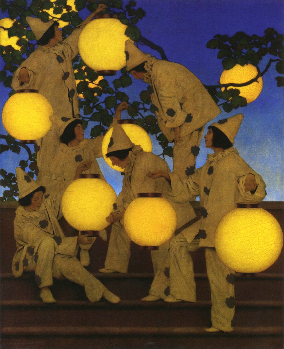
That color in the sky is now referred to as “Parrish blue.” Can you even imagine using a color so masterfully that it comes be named after you? It shows up most prominently in Griselda (1910):
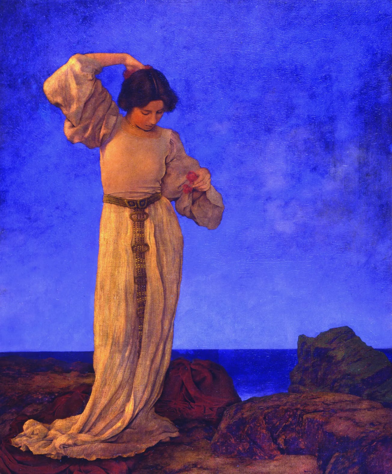
Parrish blue is often referred to as the source of his paintings’ dream-like quality, but I think other factors are strong contributors as well. For example, his subjects never seem to cast a real shadow. Every one of them seems to be lit perfectly from some ambient glow.
He also uses deep DEEP focus (like Citizen Kane). Rarely is there something in the middle ground, but his unbelievably detailed, layered backgrounds are just as in-focus as the unbelievably detailed characters in the foreground. It really captures the scale and distance of the landscape.
Here. Bask in the glory of Jason and His Teacher (1909):
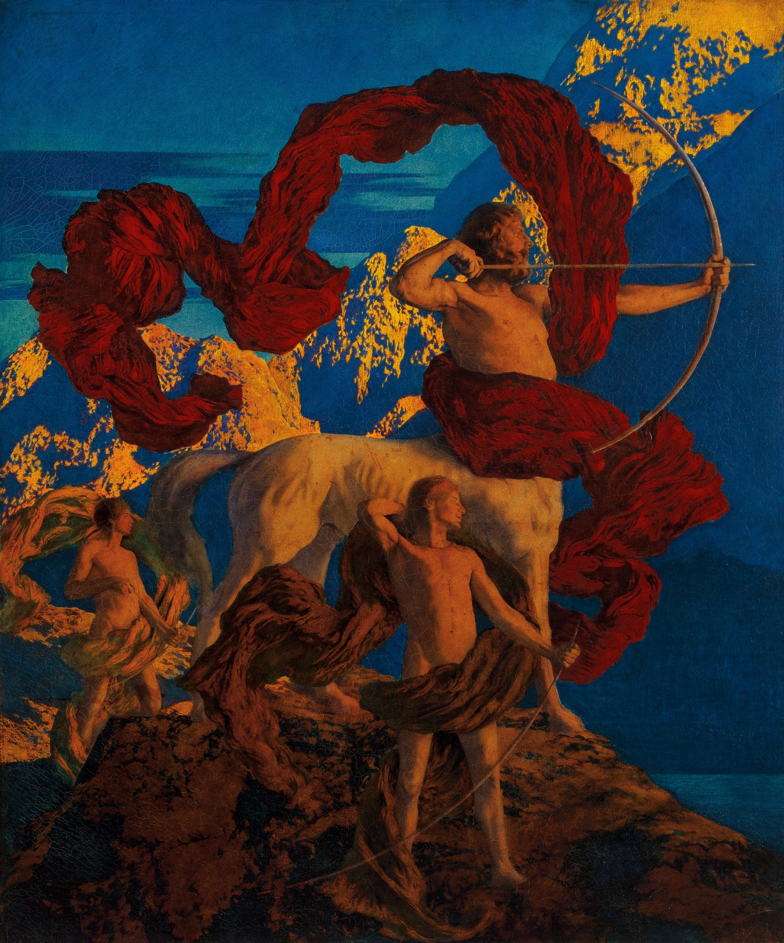
His most famous work (and possibly the bestselling print of all time) is Daybreak (1922):
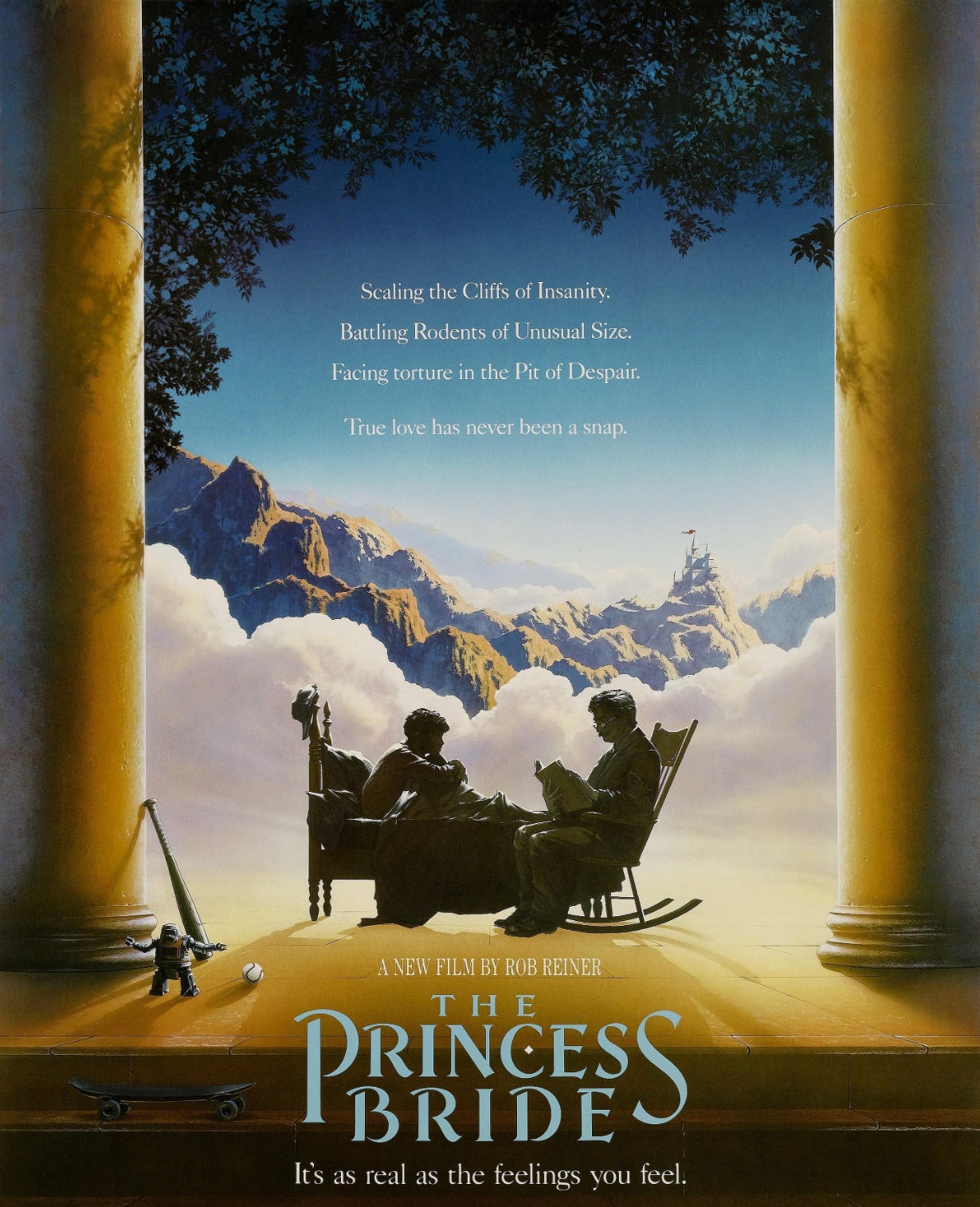
This piece has influenced countless album covers, movie posters, and other other works of art. If it looks familiar and you are trying to put your finger on it, I think I can help:
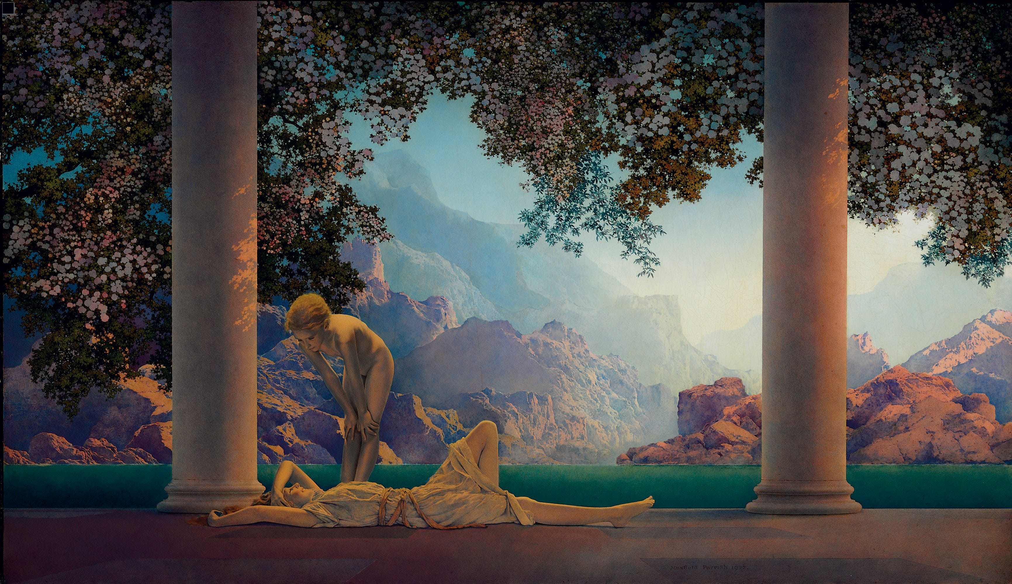
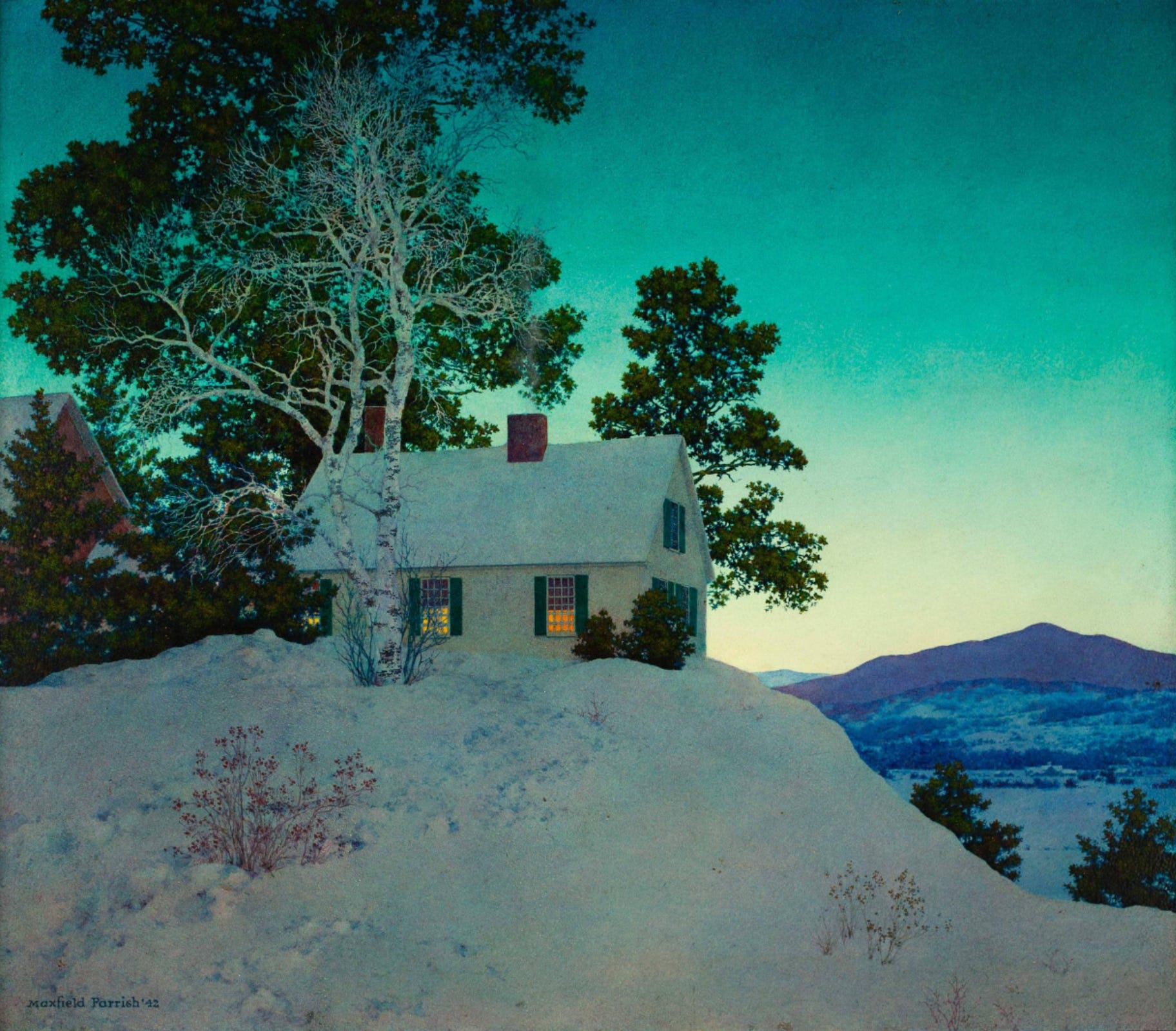
For decades, Parrish’s career centered around elaborate book illustrations for collections of fairy tales and nursery rhymes (check out this gorgeous Puss in Boots from 1913) and paintings of young people experiencing exquisite freedom and peace of mind in majestic natural settings (two spectacular examples below).
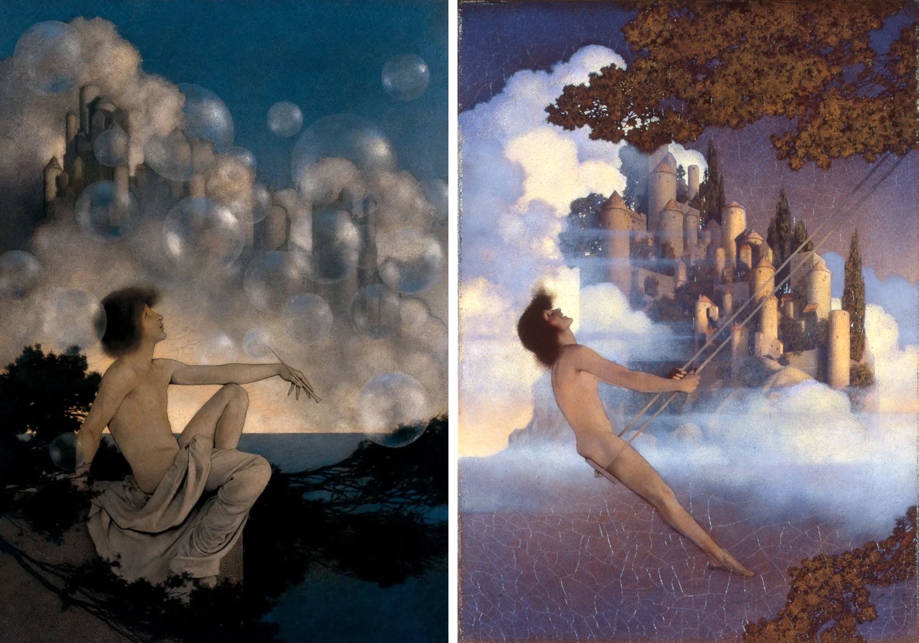
Then, in 1931, Parrish announced… “I’m done with girls on rocks.” He had painted them for thirteen years (by his own estimation). He knew it would be lucrative to continue to do it for the rest of his life, but he was bored.
It’s funny; I hadn’t realized that Parrish was the “girls on rocks” guy for the longest time. The paintings I loved him for were landscapes, and it wasn’t until I started reading more about him that I realized he was right to describe the bulk of his career this way. Here are just a few of the greats:
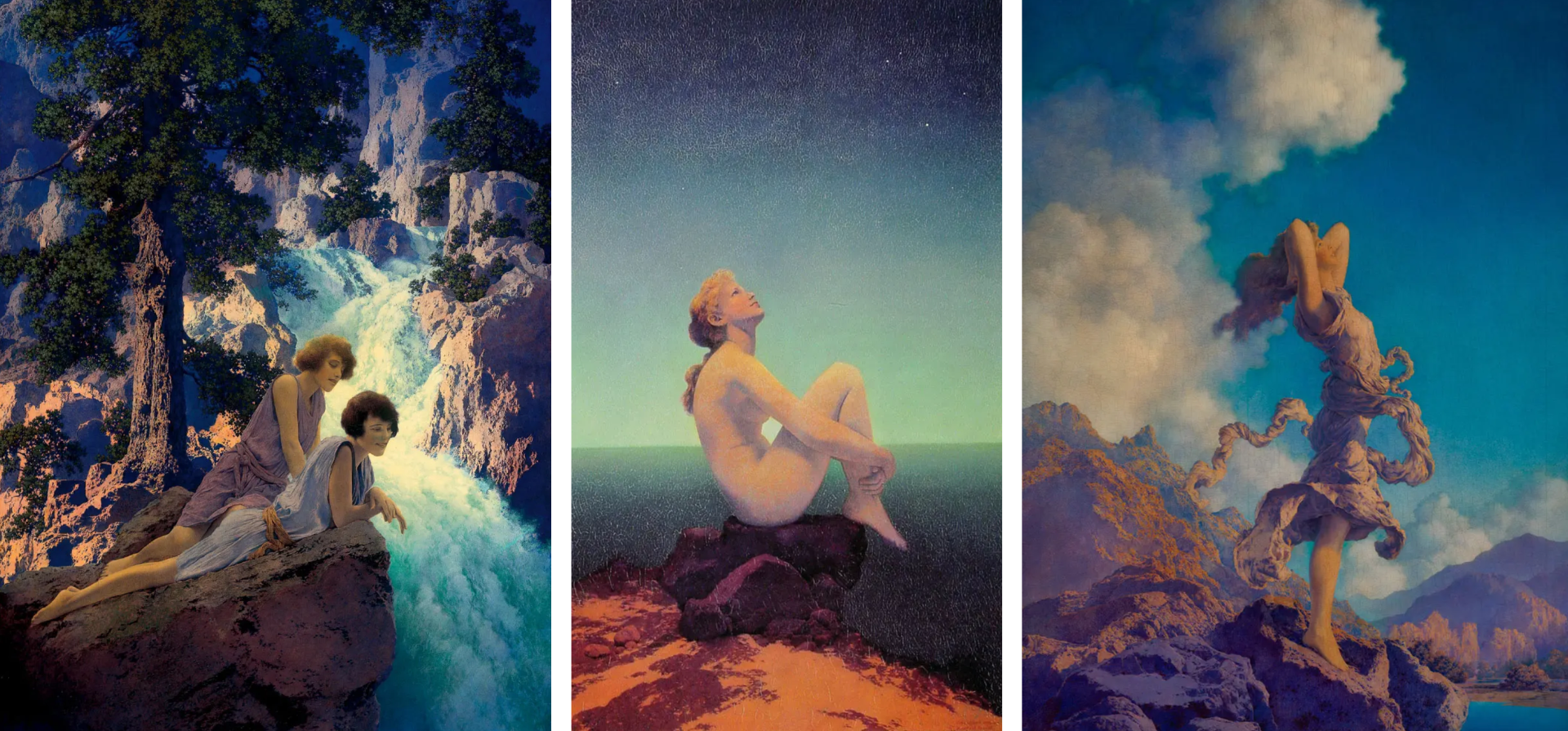
But in 1931, he flipped the switch and became a fulltime landscape guy. With anyone else, I would have said that was a step in the wrong direction, but Parrish always brings his A-game. His landscapes are simply stunning, and they are the reason we first fell in love!
It was challenging finding great images of his landscape to include in this post for a number of reasons. The first being that many of his landscapes are owned by private collections. Luckily, you can still see the old listings on fancy auction websites. Evening (1944) sold at Christie’s in 2015. At Close of Day (1941) sold at Heritage Auctions in 2011. And my absolute favorite, Old White Birch (1937) sold at the Illustrated Gallery.
Old White Birch is also a perfect example of the second challenge: People color correct them! His electric green skies and golden-hour trees (which practically buzz with orange) are simply too much for some human minds to grasp, and so they assume that the image must be wrong. NO, humans; It’s YOU who are wrong. Check out the majesty of Old White Birch in all of its jewel-toned glory:

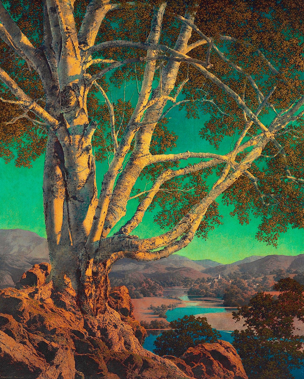
Just look at that sexy little blue river sneaking through at the bottom! The colors! The balance! My God! I could stare at this for hours. These landscapes have changed my brain, and I now seek these colors out at every opportunity. Just look at The Old Shoebox home page! You can see Parrish’s color palette right there in the logo and background.
Anyway, I hope you saw something today that sets your brain on fire. I would love to hear about it if you do, or if you have another favorite Parrish painting!
A Few More Treasures for the Road
In honor of Saturday Night Live’s 50th birthday, I would like to share with you some (but by no means all) of my all-time favorite sketches. Enjoy!
Stay safe, warm, and well, everyone! Until we meet again!
It's time to write a book, Erin. You have that special talent.
Wow, those paintings are gorgeous. I definitely have to look up more of his work sometime. Thank you for introducing him!